Alert
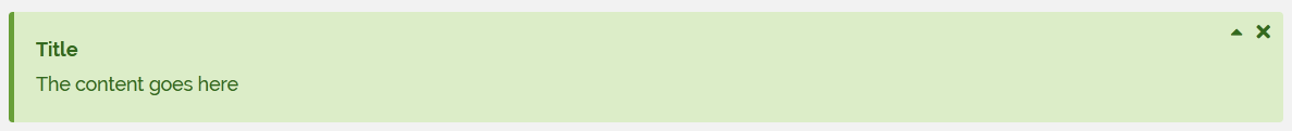
Alerts are the main component to give feedback to the user or communicate page specific to system wide messages. Alerts are a rectangular component displaying a title and a message.
Output
- Success Alert
- Failure Alert

- Information Alert

- Warning Alert

Twig Tag
- Tag
UIAlert
- Syntax
{% UIAlert Type {Parameters} %}
    Content Goes Here
{% EndUIAlert %}
- Type
Make a basis Alert component |
|
Make an Alert component for informational messages |
|
Make an Alert component for successful messages |
|
Make an Alert component for warning messages |
|
Make an Alert component for danger messages |
|
Make an Alert component for failure messages |
|
Make an Alert component with primary color scheme |
|
Make an Alert component with secondary color scheme |
Alert Neutral
- syntax
{% UIAlert Neutral {sTitle:'value', sContent:'value', sId:'value'} %}
    Content Goes Here
{% EndUIAlert %}
- parameters
sTitle |
string |
optional |
‘’ |
Title of the alert |
sContent |
string |
optional |
‘’ |
The raw HTML content, must be already sanitized |
sId |
string |
optional |
NULL |
id of the html block |
Alert ForInformation
- syntax
{% UIAlert ForInformation {sTitle:'value', sContent:'value', sId:'value'} %}
    Content Goes Here
{% EndUIAlert %}
- parameters
sTitle |
string |
optional |
‘’ |
Title of the alert |
sContent |
string |
optional |
‘’ |
The raw HTML content, must be already sanitized |
sId |
string |
optional |
NULL |
id of the html block |
Alert ForSuccess
- syntax
{% UIAlert ForSuccess {sTitle:'value', sContent:'value', sId:'value'} %}
    Content Goes Here
{% EndUIAlert %}
- parameters
sTitle |
string |
optional |
‘’ |
Title of the alert |
sContent |
string |
optional |
‘’ |
The raw HTML content, must be already sanitized |
sId |
string |
optional |
NULL |
Alert ForWarning
- syntax
{% UIAlert ForWarning {sTitle:'value', sContent:'value', sId:'value'} %}
    Content Goes Here
{% EndUIAlert %}
- parameters
sTitle |
string |
optional |
‘’ |
Title of the alert |
sContent |
string |
optional |
‘’ |
The raw HTML content, must be already sanitized |
sId |
string |
optional |
NULL |
id of the html block |
Alert ForDanger
- syntax
{% UIAlert ForDanger {sTitle:'value', sContent:'value', sId:'value'} %}
    Content Goes Here
{% EndUIAlert %}
- parameters
sTitle |
string |
optional |
‘’ |
Title of the alert |
sContent |
string |
optional |
‘’ |
The raw HTML content, must be already sanitized |
sId |
string |
optional |
NULL |
id of the html block |
Alert ForFailure
- syntax
{% UIAlert ForFailure {sTitle:'value', sContent:'value', sId:'value'} %}
    Content Goes Here
{% EndUIAlert %}
- parameters
sTitle |
string |
optional |
‘’ |
Title of the alert |
sContent |
string |
optional |
‘’ |
The raw HTML content, must be already sanitized |
sId |
string |
optional |
NULL |
id of the html block |
Alert WithBrandingPrimaryColor
- syntax
{% UIAlert WithBrandingPrimaryColor {sTitle:'value', sContent:'value', sId:'value'} %}
    Content Goes Here
{% EndUIAlert %}
- parameters
sTitle |
string |
optional |
‘’ |
Title of the alert |
sContent |
string |
optional |
‘’ |
The raw HTML content, must be already sanitized |
sId |
string |
optional |
NULL |
id of the html block |
Alert WithBrandingSecondaryColor
- syntax
{% UIAlert WithBrandingSecondaryColor {sTitle:'value', sContent:'value', sId:'value'} %}
    Content Goes Here
{% EndUIAlert %}
- parameters
sTitle |
string |
optional |
‘’ |
Title of the alert |
sContent |
string |
optional |
‘’ |
The raw HTML content, must be already sanitized |
sId |
string |
optional |
NULL |
id of the html block |
Alert common parameters
AddCSSClass |
string |
CSS class to add to the generated html block |
AddCSSClasses |
array |
like <code>[‘ibo-is-hidden’, ‘ibo-alert–body’]</code> |
AddCssFileRelPath |
string |
|
AddDeferredBlock |
iUIBlock |
|
AddHtml |
string |
|
AddJsFileRelPath |
string |
|
AddMultipleCssFilesRelPaths |
array |
|
AddMultipleJsFilesRelPaths |
array |
|
AddSubBlock |
iUIBlock |
|
CSSClasses |
array |
like <code>[‘ibo-is-hidden’, ‘ibo-alert–body’]</code> |
Color |
string |
Color of the alert (check CSS classes ibo-is-<color> for colors) |
Content |
string |
The raw HTML content, must be already sanitized |
DataAttributes |
array |
Array of data attributes in the format [‘name’ => ‘value’] |
DeferredBlocks |
array |
|
HasForcedDiv |
bool |
|
IsClosable |
bool |
Indicates if the user can remove the alert from the screen |
IsCollapsible |
bool |
Indicates if the user can collapse the alert to display only the title |
IsHidden |
bool |
|
OpenedByDefault |
bool |
Indicates if the alert is collapsed or not by default |
SubBlocks |
array |
|
Title |
string |
Title of the alert |
Examples
Example to generate an temporary information with a spinner (on the real display the spinner is animated)
{% UIAlert ForInformation {'sId':'header-requirements', 'IsCollapsible':false, 'IsClosable':false} %}
    {% UIContentBlock Standard {'aContainerClasses':['ibo-update-core-header-requirements'],
                                'sId':'can-core-update'} %}
        {{ 'iTopUpdate:UI:CanCoreUpdate:Loading'|dict_s }}
        {% UISpinner Standard {} %}
    {% EndUIContentBlock %}
{% EndUIAlert %}
The information displayed:

The javascript to set a success or a failure in return of an ajax call
function (data) {
    var oRequirements = $("#header-requirements");
    var oCanCoreUpdate = $("#can-core-update");
    oCanCoreUpdate.html(data.sMessage);
    oRequirements.removeClass("ibo-is-information");
    if (data.bStatus) {
        oRequirements.addClass("ibo-is-success");
    } else {
        oRequirements.addClass("ibo-is-failure");
    }
}
Example to generate a hidden alert to display using javascript in case of error
{% UIAlert ForFailure {sId:"dir_error_outer", IsCollapsible:false, IsClosable:false, IsHidden:true} %}
    *The content goes here*
{% EndUIAlert %}
The javascript to show the alert
$("#dir_error_outer").removeClass("ibo-is-hidden");
The error displayed:
