Button
Class Button
Output
- Example Buttons
Twig Tag
- Tag
UIButton
- Syntax
{% UIButton Type {Parameters} %}
- Type
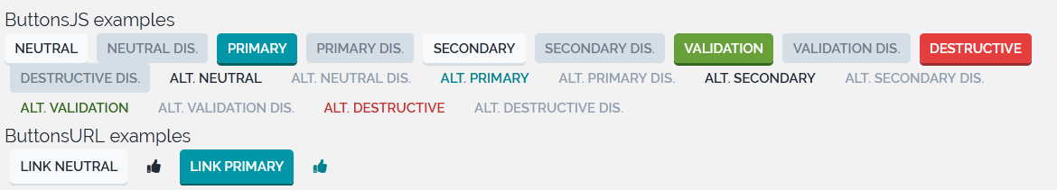
Make a basis Button component for any purpose |
|
Make a Button component for a primary action, should be used to tell the user this is the main choice |
|
Make a Button component for a secondary action, should be used to tell the user this is an second hand choice |
|
Make a Button component for a success action, should be used to tell the user he/she going to make a positive action/choice |
|
Make a Button component for a destructive action, should be used to tell the user he/she going to make something that cannot be |
|
Make a basis Button component for any purpose |
|
Make a Button component for an alternative primary action, should be used to avoid the user to consider this action as the first |
|
Make a Button component for an alternative secondary action, should be used to avoid the user to focus on this |
|
Make a Button component for a validation action, should be used to avoid the user to focus on this |
|
Make a Button component for a destructive action, should be used to avoid the user to focus on this |
|
Make a Button component for a cancel, should be used only for UI navigation, not destructive action |
|
@param string $sIconClasses |
|
Make a link Button component to open an URL instead of triggering a form action |
|
@param string $sIconClasses |
|
@param string $sIconClasses |
Examples
No examples provided yet